🎧🎶 Release notes designed to be listed to with: "Once there were dragons" @ 4:05
Highlights 🤾♀️
- 👩🎨 Stunning animation improvements
- 📖 Overhauled documentation
- 📱 More predictable touch dragging
- 🏠 Simplified home list styling
- 💅 New project design
- 📝 Blogs of our learnings
Beautiful 🏔
This release pushes react-beautiful-dnd to new summits of interaction design.
We have removed instant movement (snapping) when moving between lists. Snapping breaks the visual language of moving physical objects around that react-beautiful-dnd is trying to emulate.
✅ No snapping when moving between lists

❌ This is what it used to be (snapping in the 🏠 home list after a drop)

You do not need to do anything to get the new animation pattern. I have marked this change as a feature release as it is new design behaviour.
Blog: Beautiful interactions 📝
There was a huge amount of work to remove snapping when moving between lists. Who would have thought? Not me 🥵. I wrote a blog which goes over the journey of this feature in depth. Personally, I think it well worth your time!
📝Blog → Beautiful interactions: Crafting elegant and robust drag and drop animations
New logo 👩🎨
We have moved to a logo that encapsulates the playfulness and delight that we are striving for with react-beautiful-dnd
Blog: Logo creation 📝
Maryanne Nguyen, a very talented designer at Atlassian, has detailed her creative process in creating the new react-beautiful-dnd logo in a blog 🎨
📝Blog → maryannemade: react-beautiful-dnd logo
More predictable touch dragging 📱
react-beautiful-dnd tries to respect standard browser interactions as much as possible. Currently, the library plays well with force touch interactions:
If the user force presses on the element before they have moved the element (even if a drag has already started) then the drag is cancelled and the standard force press action occurs. For an anchor, this is a website preview.
Unfortunately, heavy presses can cancel a drag. It can be tricky at times to get the right amount of pressure to correctly use touch dragging. This can be frustrating for users.
We have added an option for you to opt-out of respecting force touch interactions. This option will disable force press interactions on the drag handle. However, it allows for a more consistent touch dragging interaction.
We have added shouldRespectForceTouch as a prop to <Draggable />. It defaults to true in order to respect force touch interactions, but you can set it to false to opt out of respecting force touch
<Draggable
  draggableId="draggable"
+ shouldRespectForceTouch={false}
>

</Draggable>
This change resulted in a feature release. The default behaviour matches the behaviour of previous versions.
Should force touch be respected by default?
Right now shouldRespectForceTouch defaults to true in order to respect browser interactions. However, for this specific use case, I am thinking that the default could be to not respect force touch in order to have a more consistent touch dragging experience out of the box.
I have created a request for discussion to collect other people's thoughts on what the default should be.
Simplified home list styling 🏠
We have added a new value to the DroppableStateSnapshot: draggingFromThisWith
type DroppableStateSnapshot = {|
  isDraggingOver: boolean,
  draggingOverWith: ?DraggableId,
+ draggingFromThisWith: ?DraggableId,
|};
draggingFromThisWith is populated with the draggableId of the dragging item in the 🏠 home list for the entire drag. This allows you to style the home list differently from the other lists if you like. We recommend you do this to make it clear which list the user is dragging from. You can read more about the thinking behind this in my blog
In this example we set the background-color of the home list to pink when we are dragging over the list. We set the background-color of the home list to blue when not dragging over the home list.

Overhauled documentation 📖
We have totally overhauled our documentation to be easier to find and use information.
Our README.md was getting too big. It was hard for new comers to know where to start, and it was hard for consumers of the library to quickly find information. We have simplified our README.md and added a comprehensive documentation section which links off to categories of information.
The README.md now contains a high-level introduction to the project, feature set, how to get started and then links to the rest of the documentation.
For new comers and evaluators 👶
Information in the README.md:
- Big
gifshowing off what the library is about - Reduced badges to the critical subset to reduce noise
- High level motivation of the project
- Feature set and limitations
- Getting started guide
- An
Aboutsection which links off information useful to understand, evaluate and get started with the library.
For consumers 👩🎤
- The documentation has been broken down into more logical independent chunks to make it clearer where to find topical information. Previously
APIwas under a wall of design thinking information which would not be useful to a non-evaluator - All documentation pages have a link back to the documentation root for quickly jumping around
Documentation engineering health 👨⚕️
- Added a test to ensure that there are no more broken links 🎉. This is by far the cause of the most issues
- Added test to ensure consistent usage of component names
- Added test to ensure all documentation pages end with a backlink to the documentation root
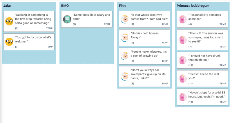
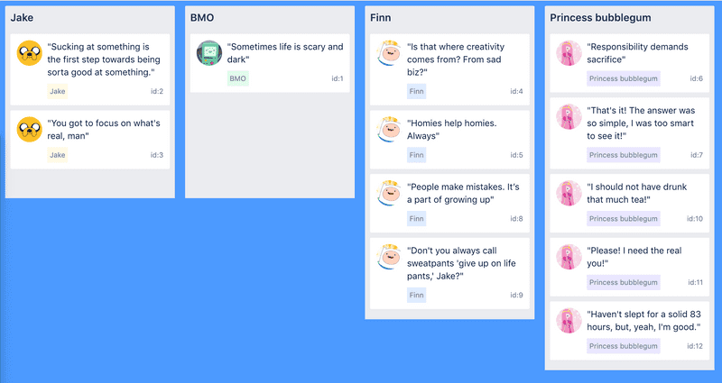
Refreshed examples 🦸♂️ #1096
We have made our examples brighter and more colourful
| Previous | New style |
|---|---|

|

|
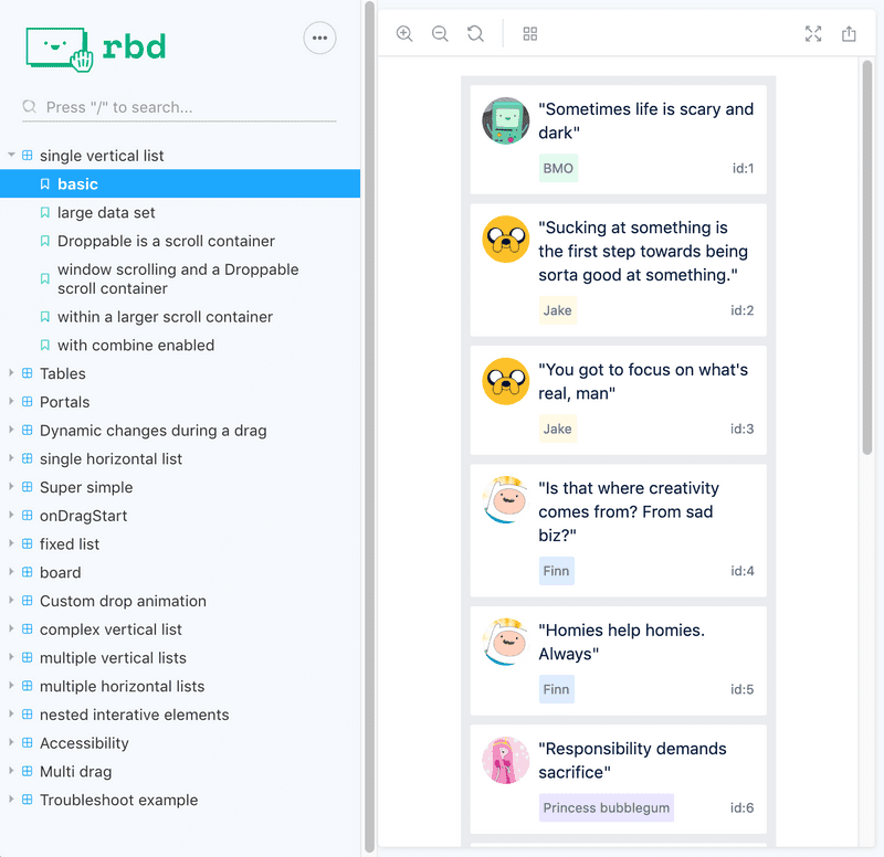
We have also upgraded to Storybook v5 and added our new logo to the header
Other improvements
- Only attaching to the
reduxdevtools whenprocess.env.NODE_ENV === 'development'#1085. Thanks @teleaziz!! - More collision engine refinements
Fixes 🐛
- A
transitionfor a property other thantransformthat finished during a drop animation on aDraggablecould cause the drop to end suddenly #1096 position:fixedlists on ie11 #1091 #1088. Thanks @InvisibleBacon for raising this one- Typo in docs #1102. Thanks @jDeppen
Engineering health
- Upgraded to
flow0.94#1119 - Upgrade of all dev dependencies #1119
- Moved example website to use
emotion👩🎤 #1128 - Moving browser tests to
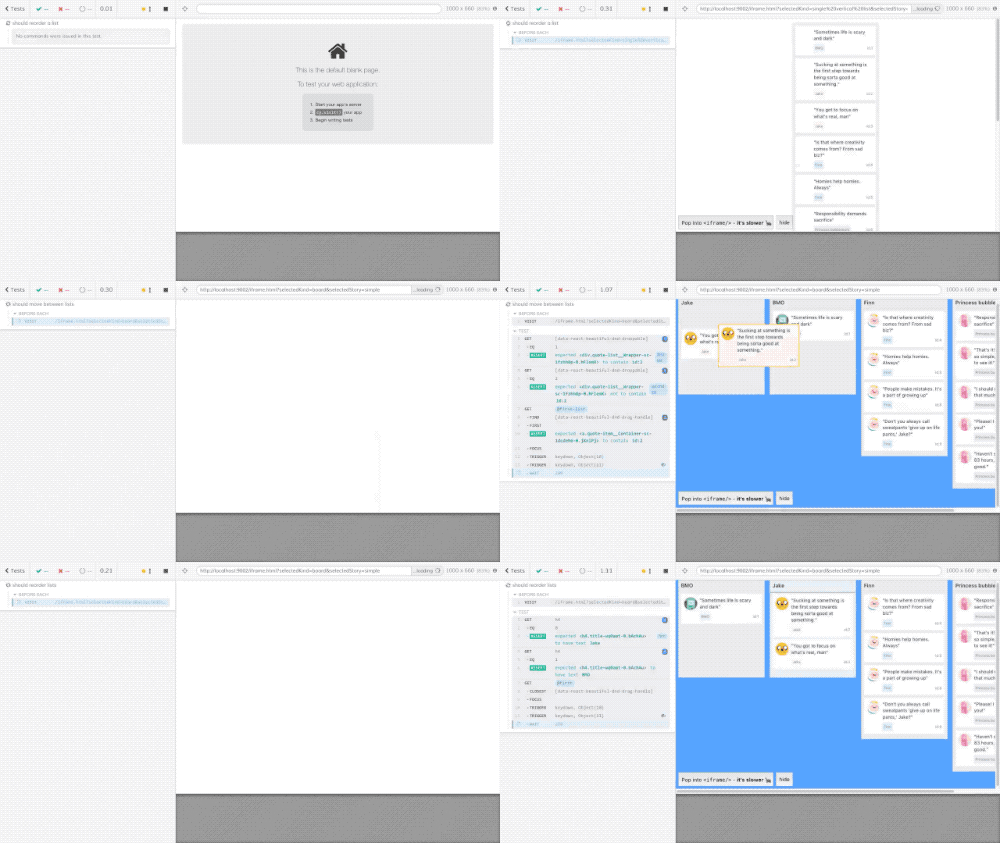
cypress.io. Also added a few more browser tests #1122


